MVP of a guided search setup that reduced setup time by 90%

the product
COSAIN is a social media listening tool that helps investigators identify risks to public safety and fraud.
The Challenge
This project set out to design a guided search feature to help users navigate a complex legacy search tool without training as a quick-win ahead of the full redesign
The impact
Reduced setup time by 90%, enabling faster response to critical public safety issues.
Easier for new and occasional users to get started without relying on extensive training.
Across interviews, focus groups, and usability tests conducted over months, users consistently flagged COSAIN as unintuitive.
key pain points
Without clear entry and exit points in the search-building process, users find the product daunting to use without training.
Overload of unclear features makes decision-making harder.
Adding search criteria is cumbersome, making it harder to build accurate searches intuitively.
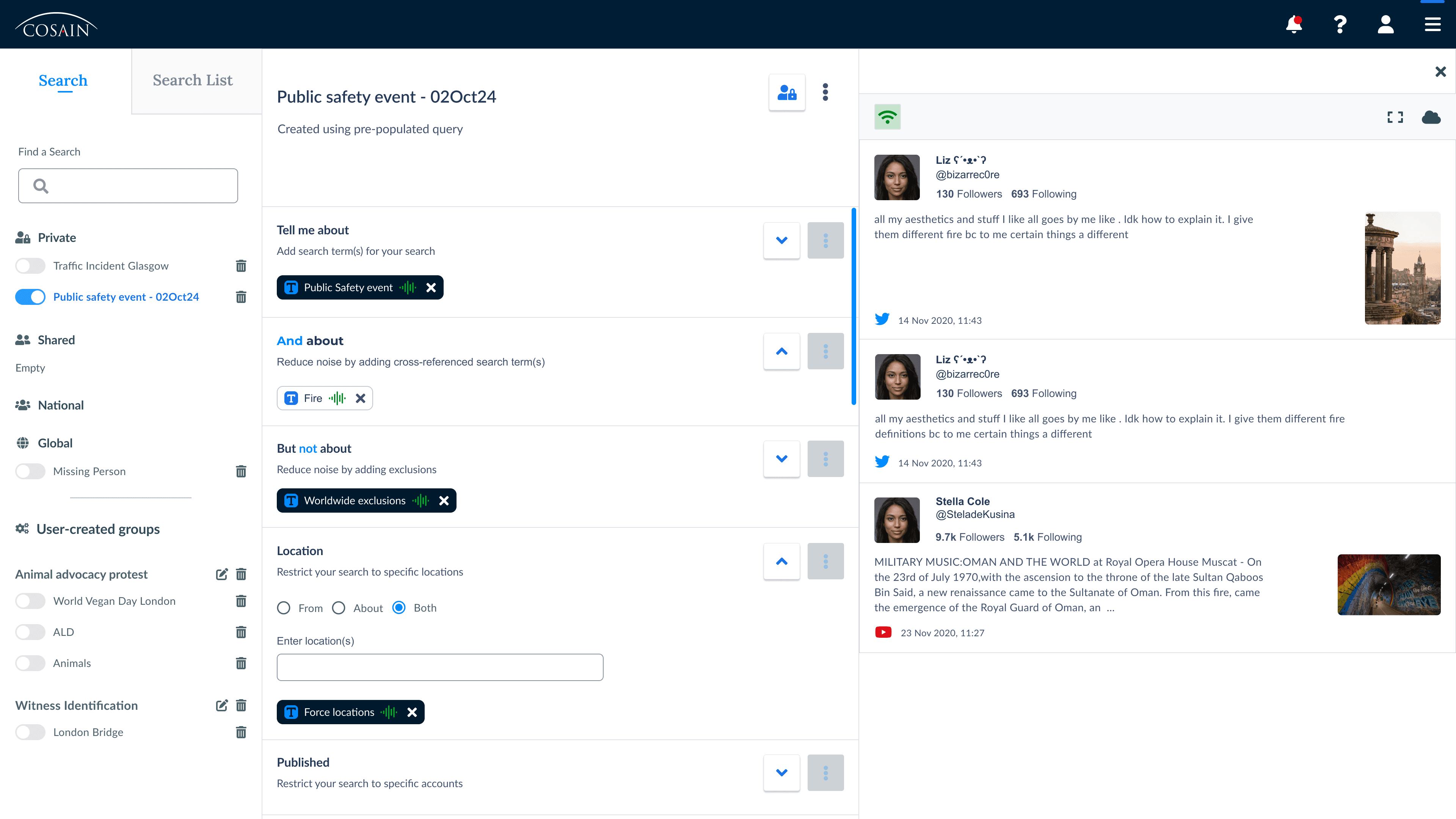
COSAIN collecting social media messages
Constraints shaped the design and timeline
Restricted changes to a product near end-of-life
It was built on a tech platform overdue for an upgrade
The product was due for a full redesign
To avoid rework, I kept changes minimal, didn't touch outdated structures, UI or tech that were soon to be replaced.
Sudden prioritisation due to competition pressure
The project was fast-tracked after user loss and increased pressure from competitors
This design project became the first step of the full redesign, as a quick win to improve usability ahead of the full redesign.
To address these pain points and respond to rising competitive pressure, we focused on a quick-win solution ahead of a full redesign.
Design goal
Design a guided search flow that’s intuitive without training, with no rework on soon-to-be-replaced tech.
What happens under the hood
The product team compiled frequent users' search patterns to create templates with pre-set search criteria and reporting schedules for each one.
What the interface must deliver
I iterated on the idea of a guided onboarding and designed a non-intrusive wizard with four screens users had to complete to create a search.
Low-fidelity user flow used for usability testing
The flow begins in the existing application, where the user can start the wizard by clicking a newly added button.
The wizard opens on another page, guiding the user select a search template and customise their search.
Once completed, the user is redirected back to the application, ready to collect social media posts

Users build a search in four steps, beginning with choosing a template.
Next step
With the low-fidelity design ready, I set up usability testing sessions to validate both the idea and the design direction.
What i set out to understand
Understand if and when users would benefit from a guided process to build queries.
Assess whether the proposed solution resolves their key pain points.
Evaluate how easily users understand the flow and what actions are expected from them.
I interviewed 9 users across industries and experience levels to gather insights, despite a tight timeline,
Participants
9 users
New, intermediate and experienced
Law enforcement, Financial regulators and Politician security
Methodology
1 hour semi-structured interview
UK and Canada, remotely on Teams
Conducted over 2 weeks
Script
STEP 1
Collected background info. For repeat participants, focused on their experience creating searches.
STEP 2
Presented the design and collected feedback
STEP 3
Asked whether they’d find the feature useful, and why.
a bit of drama
Emotionally invested stakeholders
The stakeholders, mostly former law enforcement, wanted research participants who looked like them.
I pushed back : Narrowing the focus risked missing bigger commercial opportunities.
I raised it to the project manager, who backed my approach and helped get buy-in. It paid off: financial regulators in Canada, who initially felt the feature wasn’t for them, saw real value in using customised version for their industry to standardise workflows across provinces.
Testing results
While user's opinions were split on whether they’d use the feature, ALL users flagged the same concerns.
Would you use that feature if available?
“It would help us be more reactive”
Mixed level of experience users
Would improve their confidence working with the product
Would improve user experience across various real-life scenarios
“I don’t like that I don’t see what I am creating”
All very experienced users
Frustrated by hidden background activity
No improvement to their experience
Actually "yes" and "no" meant the same thing: When users can’t see what’s happening, they feel out of control, sparking both frustration and confusion.
some quotes from users
“Is this a new way of working or can I still work the old way?”
“Can I still access COSAIN as usual?”
“Can I tweak the search further when I am done?”
“I need to know what the search is pre-populated with before I customise it”
Next step
I took advantage of having three additional interviews scheduled two days after the usability test deadline to quickly redesign the flow based on user feedback and test the updated design.
With three follow-up interviews just after the deadline, I quickly redesigned the flow to address the main usability issue: the perceived lack of control, and tested the update right away.
a bit of drama
Managing tech lead frustration
The tech lead wasn’t sold on doing user interviews instead of focusing on the technical implementation.
To explain the value of user research for this project, I created the research study document below. It helped clear things up and opened the door to better team communication.
I quickly iterated and designed a walkthrough with modal prompts and highlights to help users customise their search step by step.
fast-tracked redesign to gather quick feedback

USER FLOW: User stays within the app and gets instructions via modals
The redesign addressed the main pain point around lack of visibility, but ultimately didn’t land as the right solution.
redesign usability testing insights
Issues addressed
No more feeling of disconnection from the search tool
Users aware that they have control over searches
Easy identification of pre-populated information
Why this redesign doesn't work
Accessibility issue
The content behind the grey overlay is intended to be scanned; however, the text and colour may be difficult to see for users with visual impairments.
Lack of intuitiveness
The design of the legacy product is cluttered, and adding instruction modals only adds to the confusion, making it less user-friendly.
Next step
With both design and technical concerns in mind, I adjusted the final version to strike a balance: improving the user experience without altering the design of the search tool, which was due for a full redesign.
I simplified the flow into a one-step process that delivers immediate value by focusing on core functionality, leaving space to add guidance as the tool evolves.
user flow: Cut down from four steps to one
90% of the search set-up can be achieved in a single step instead of four.
To keep users in context, I shifted the template list to a modal overlay, addressing testing feedback that separate pages disrupted their flow and sense of control
template list: 1st iteration vs mvp
AFTER: Final MVP design delivered before project closure
This approach meets the core design objective and balances accessibility and technical constraints
Accessibility issues addressed
The modal keeps users within the same context, preventing the feeling of starting a new journey away from the search tool.
Content updates quietly beneath the modal, keeping the experience focused and accessible.
Works despite technical limits
This feature does not require any design or technical update on the search tool, besides the button to trigger the wizard.
Design goal achieved
The users can create a search from a template with little to no guidance required to use the tool. This is a massive improvement for a tool that could not be used without extensive and expensive training.
Unfortunately, the project was closed a few weeks before the implementation start date. Here is what else I would have done given more time.
More testing and collect data analytics
My plan was to launch the feature, then monitor usage through feedback and analytics by tracking who used it, how often, and where they dropped off, in order to refine the experience based on real behaviour.
I wanted to explore a few ideas both inside and just beyond the MVP scope.
add visual interest
Icons
I used FontAwesome icons, the default icon set for all projects, but it didn’t offer distinct icons for each template. With more time, I would’ve designed custom icons tailored to the search templates
Improve design of last modal
I'd revisit the design of the final instruction modal to make it more consistent with the rest of the UI, even if it's just the MVP.
research more templates
Industry specific templates
During testing, Canadian financial regulators showed interest in templates tailored to their sector. It would’ve been valuable to explore how this approach could benefit other industries.
Generic templates
I also considered a more flexible, goal-oriented option, letting users investigate an event, location, or topic. This could reduce the need for training and make the tool more accessible to new and occasional users.
Set up time reduced by 90%
By streamlining the search into one guided step, setup time was estimated to drop by 90%. Users no longer had to figure out where each item belonged — they simply added a few keywords to customise the search by event, location, or topic.
Quotes from users
"This would be ideal to use in high-pressure situation, like an impromptu VIP visit or a public safety concern"
"That would be something that I'd go to for most of our search"
"This would encourage us to be more intrusive in using the search tool. You know, we'd be more inclined to just nip and do a quick search on in the middle of other things"
What I learned
Don’t just copy competitors. Listen to your users.
We were originally inspired by a competitor’s multi-step wizard. Some of our former users had switched to that product, and we suspected it was because of the clearer, more guided process.
Naturally, I started by designing and testing variations of a multi-step flow. But user testing told a different story. Our users didn’t want to be handheld. They preferred a simpler approach that gave them more flexibility to customise the search.
Eventually, I landed on one-step process that offered some guidance without feeling restrictive. It worked because it reflected their workflow, not just what looked good on paper or what worked elsewhere.
Takeaway: It’s fine to look at competitors, but always validate design choices with your own users.
What I'd change
I wouldn’t rush testing
After the initial usability sessions, it was clear the design needed reworking and another round of testing. Pressed for time, I used three post-deadline interview slots to quickly redesign and validate a new version.
While the results were promising, I wish I’d taken more time to revise the design and pushed back on delivery. Testing with at least five users would have given me more confidence in the changes.