From functional to usable: Redesigning a results view users called a game changer

the product
Designed for law enforcement and intelligence teams, this tool reveals a person’s digital footprint by searching multiple data sources in one go - one of which exposes detailed personal data such as known associates, contact details, past employers, financial details and more.
the Challenge
The results view for this data source was functional but failed where it mattered most: usability.
Given that this data source was one of the product’s biggest selling points, improving the experience was essential — a redesign was needed.
solution preview
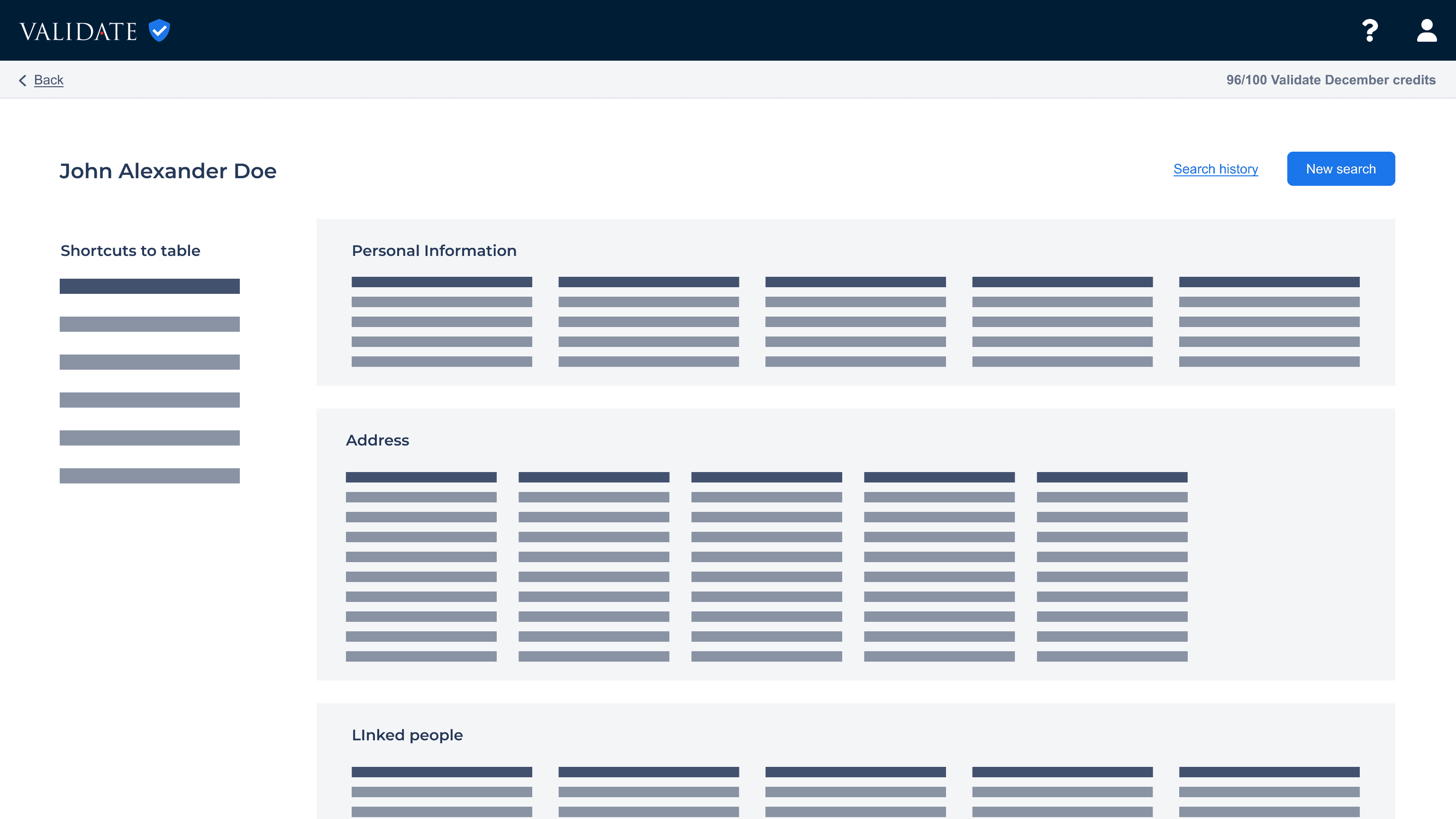
From column chaos to readable rows
Toggle between the before and after version by dragging the icon in the centre
redesign impact
Missing person found
Customer support informed the team that the data source was used in a missing person case and played a crucial role in helping locate the individual.
Identifying key details in national security cases
It was also reported that the data source was used to identify addresses and associates of a person of interest in a national security case.
constraints that influenced the design
Lack of UX mindset
Usability wasn’t a priority: the team saw the feature as done and were eager to move on.
Reluctance to revisit code
Developers were understandably resistant to change code they had already invested a lot of time in.
Only black and blue as primary colours
Basic components were missing or limited
My goal was to advocate for users, and redesign a key part of the product - not just to make it work, but to make it usable, useful, and reliable.
“Clunky” was how one user described the results view — though the data was valuable, researchers couldn’t interact with the data. Some couldn’t fit it into their workflow, others chose not to use it at all.
key pain points
Hard to scan at a glance
The layout forced constant eye-jumping, slowing researchers down when speed was key.
Can't keep track of search journey
Users had no way to trace their steps while drilling into data—crucial for documenting findings and building evidence.
Source confusion while drilling
Users kept second-guessing where they were drilling—undermining trust and making them question the tool's reliability.
The design made scanning uncomfortable, with too much eye movement required and key details shifting out of view, breaking the user’s flow and affecting trust in the product.

Use the scroll to see the data falling outside the viewport
Tables made sense, but the mix of data called for smart organisation. Using realistic data, I tried different layouts to find a structure that supports comfortable scanning.
some page layout iterations


The final layout lets each categories span the full page for clarity, with static details like gender are in the header. Only tables with data appear, showing info in single rows and adding columns as needed.
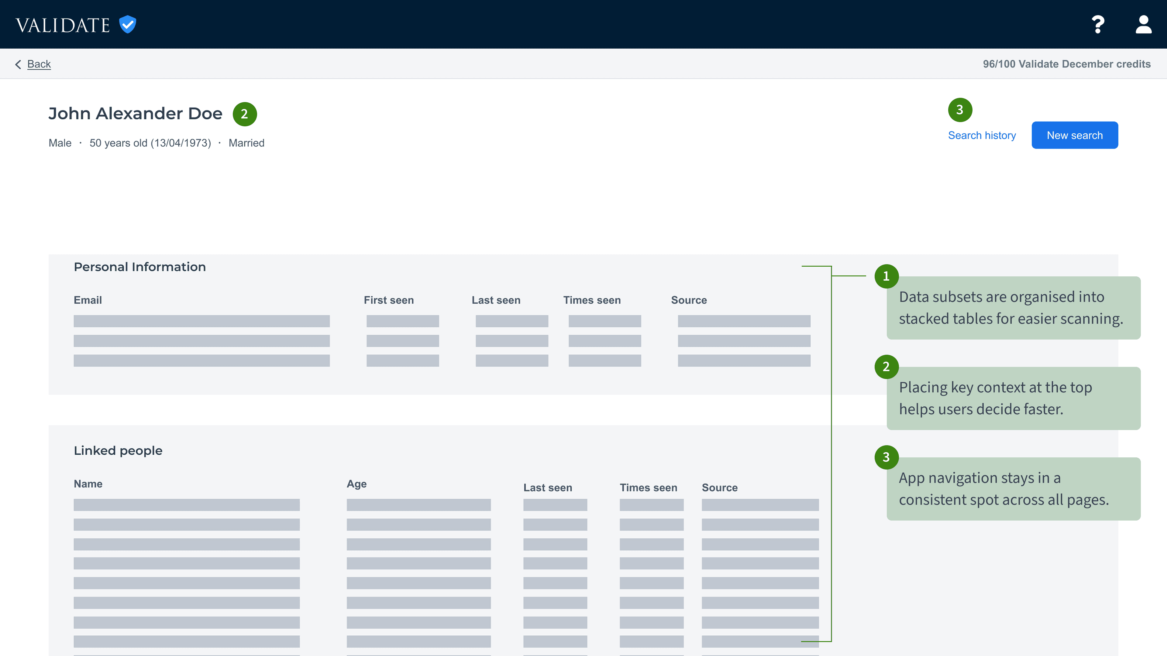
ADOPTED: Final page layout using table format spread across the page
Next step
Once the page layout was sorted, I tackled the table and header design to address the remaining user pain points.
This data source reveals detailed personal info and lets users drill into any item—click an associate to see their details or an address to find everyone linked to it—making exploration dynamic and interconnected.
That’s why a distinct design was essential to signal when users were navigating this source.

Example of drilling flow
To clear up confusion about drilling into the same data source, I created a distinct header highlighting its uniqueness. This also allowed me to introduce an accent colour within the limited design system.
Distinct header to bring clarity and visual interest
I also added distinct icons to quickly identify what type of data is on the page and add visual interest.

Person

Mobile


Location

Landline

Ip address
Next step
What’s left is making it easier for users to track and document their searches.
A breadcrumb navigation was added at the top of the page to help users track their progress, navigate with ease and document their search for evidential purpose.

Basic breadcrumb structure
Make the logic visual to the developers
To explain the breadcrumb behaviour, I mapped out real user scenarios and created visuals for each page in the app.
Why it mattered: Breadcrumbs are simple to use but the logic behind-the-scene isn’t. Showing how breadcrumbs behaved across edge cases helped everyone, from developers to client-facing stakeholders understand the rules.
How it helped: I built the user story and acceptance criteria with the developers, using the illustrations to resolve confusion and validate assumptions faster.

Breadcrumbs rule - Scenario 1 out of 8

Scroll to view the redesigned results page with realistic volume of data.
key pain points addressed
Hard to scan at a glance
Table layout reduces eye movement and improves readability. Users preferred this, even with extra scrolling.
Source confusion while drilling
Clearer visual cues reduce distraction and help users stay focused on the right source.
Can't keep track of search journey
Breadcrumbs help users track steps and switch paths with ease.
Although the project was eventually cancelled, users were already interacting with the page in its mostly redesigned state. Here is what I would have done with more time.
More usability testing!
As this was the final piece of the redesign, I had hoped to run a full usability test on the entire product. The last round revealed users needed more context to fully understand the data.
Quotes from users
"This is a game changer. I can scan the results, track my searches and go back to explore other search paths. This is brillant."
"New layout is so much easier to read and scan!"
"A real improvement from the old layout"
"This is so much better! I can document my findings and explain them to my manager."
Usability will not prioritise itself
I underestimated how resistant stakeholders would be to change. Implementation was slow, and usability improvements were often seen as low priority — dismissed as “just aesthetic” or “not urgent.” I had to stay focused and use research insights to make sure key tickets were not deprioritised and advocate for the user at every step.
It reminded me that while you can trust your team to get things done, you still need to consistently advocate for the user or their needs will quietly slip off the roadmap.