IN PROGRESS

Organising a cinema night should not be a logistical nightmare.
For groups booking tickets together, the experience is often frustrating, from finding seats that work for everyone, to splitting costs or sharing tickets afterwards. This project explores how to make that process simpler, faster, and less stressful.
Goal
Design a streamlined group booking flow that better supports real users' needs: from discovery through to ticket access.
Role
As the sole designer for this project, I was responsible for the entire design process, that is user research, ideation, competitive analysis, wireframing and prototyping
Key methods
Semi-structured interviews, user journey mapping, personas
Participants
5 individuals aged 25–56, interviewed for 30 minutes
Focus
Booking habits, planning group outings, frustrations with current apps
Outcome
Identified key friction points around coordination, seating, and ticket sharing
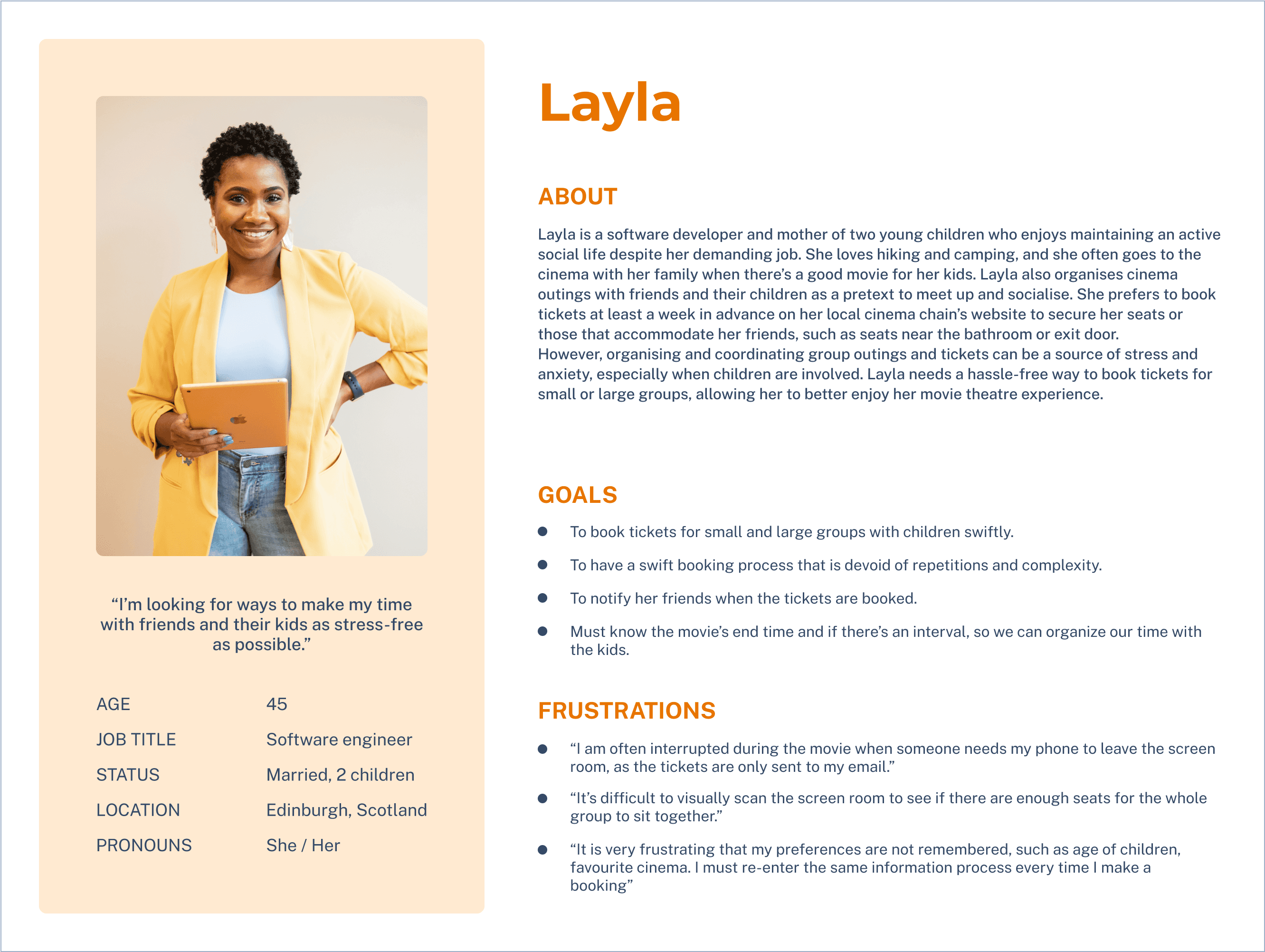
User personas
I developed personas from affinity mapping insights to guide design decisions and ensure inclusivity. They reflect a range of user goals and challenges, including edge cases.

User journey mapping
I ran each persona through typical cinema booking journeys to uncover pain points and gaps in the experience. This helped highlight where the design needed to do more to support real user needs.
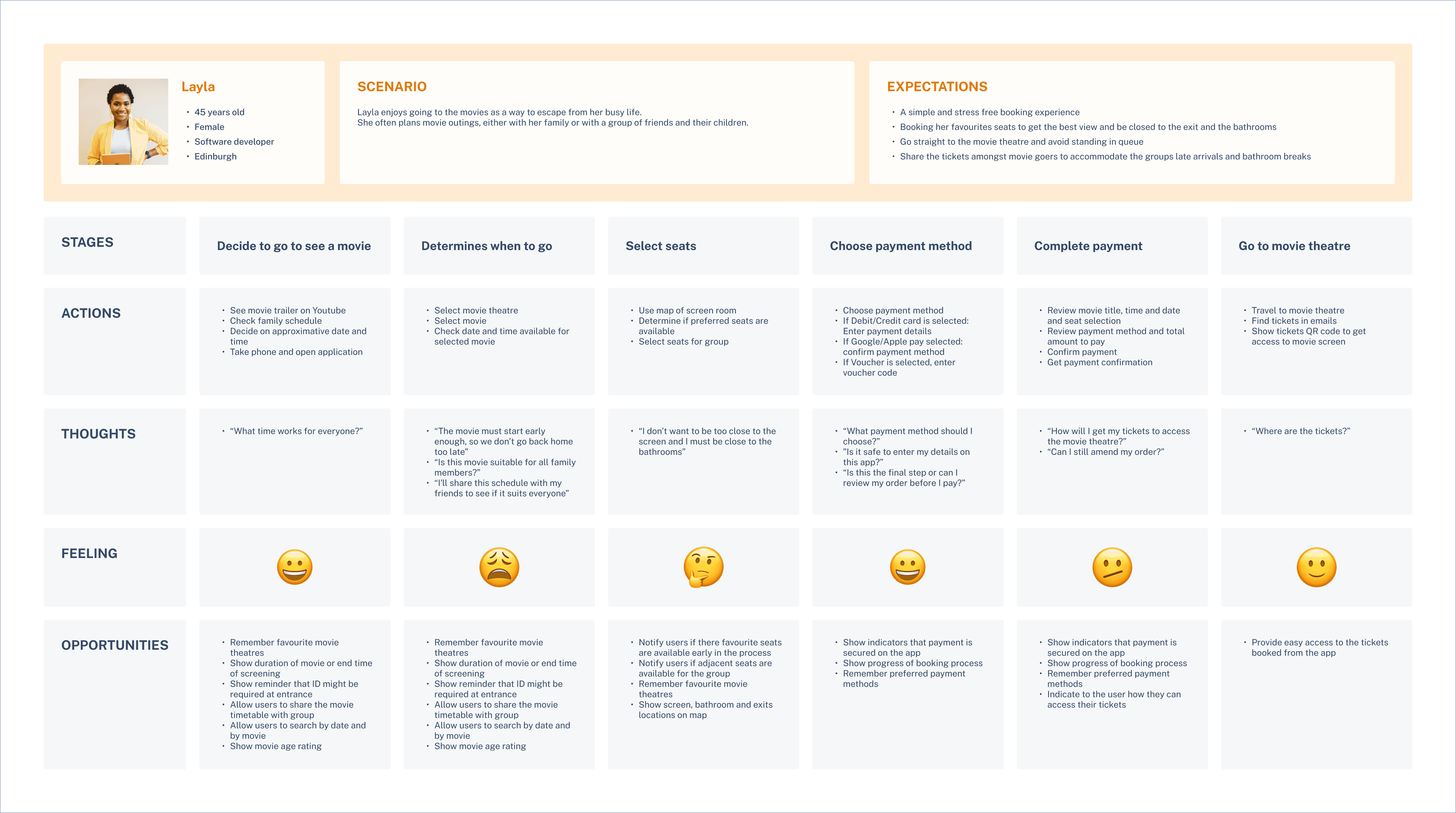
Pain points
While most users were satisfied with their booking apps for solo or small-group outings, booking for larger groups often caused friction. The experience broke down at key moments.
Hard to switch screenings
If preferred seats are taken, users must start over to change the screening — a tedious and avoidable step.
Poor ticket sharing
Sharing or accessing tickets is clunky, making group coordination harder — especially when people arrive separately or leave the screening room mid-film.
No memory of preferences
The app forgets basics like favourite cinemas, group size, or seat choices, forcing users to re-enter them every time.
Missing screening details
Key info like end times, exit proximity, or intermission options is often missing. This creates stress for parents, carers, or anyone needing flexible seating.
Based on user research and competitive audit insights, I defined the design goal as:
Allow the users to filter the movie screenings based on their seating preferences
Includes a feature to download and share tickets
Support the user by providing more movie information and save their preferences
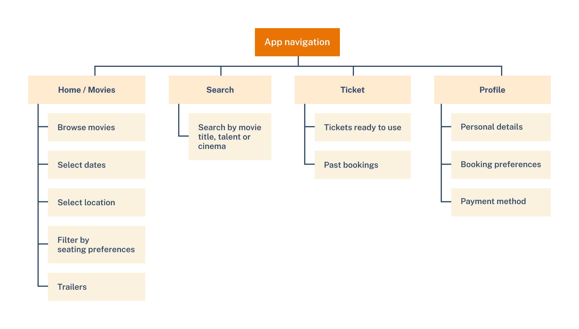
Application architecture
I mapped the app’s architecture to build a clear, flexible foundation that supports future features and smooth user flows.
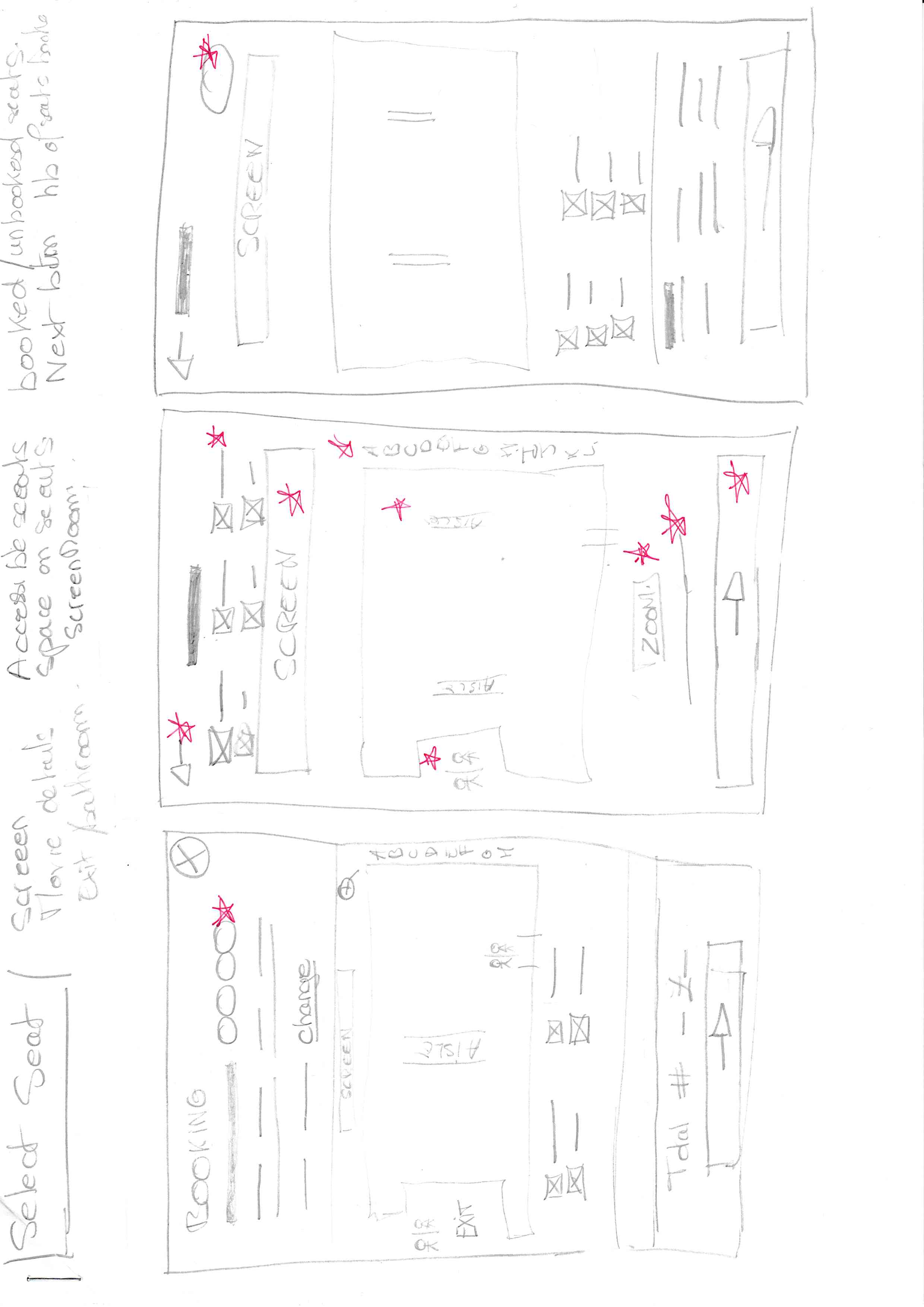
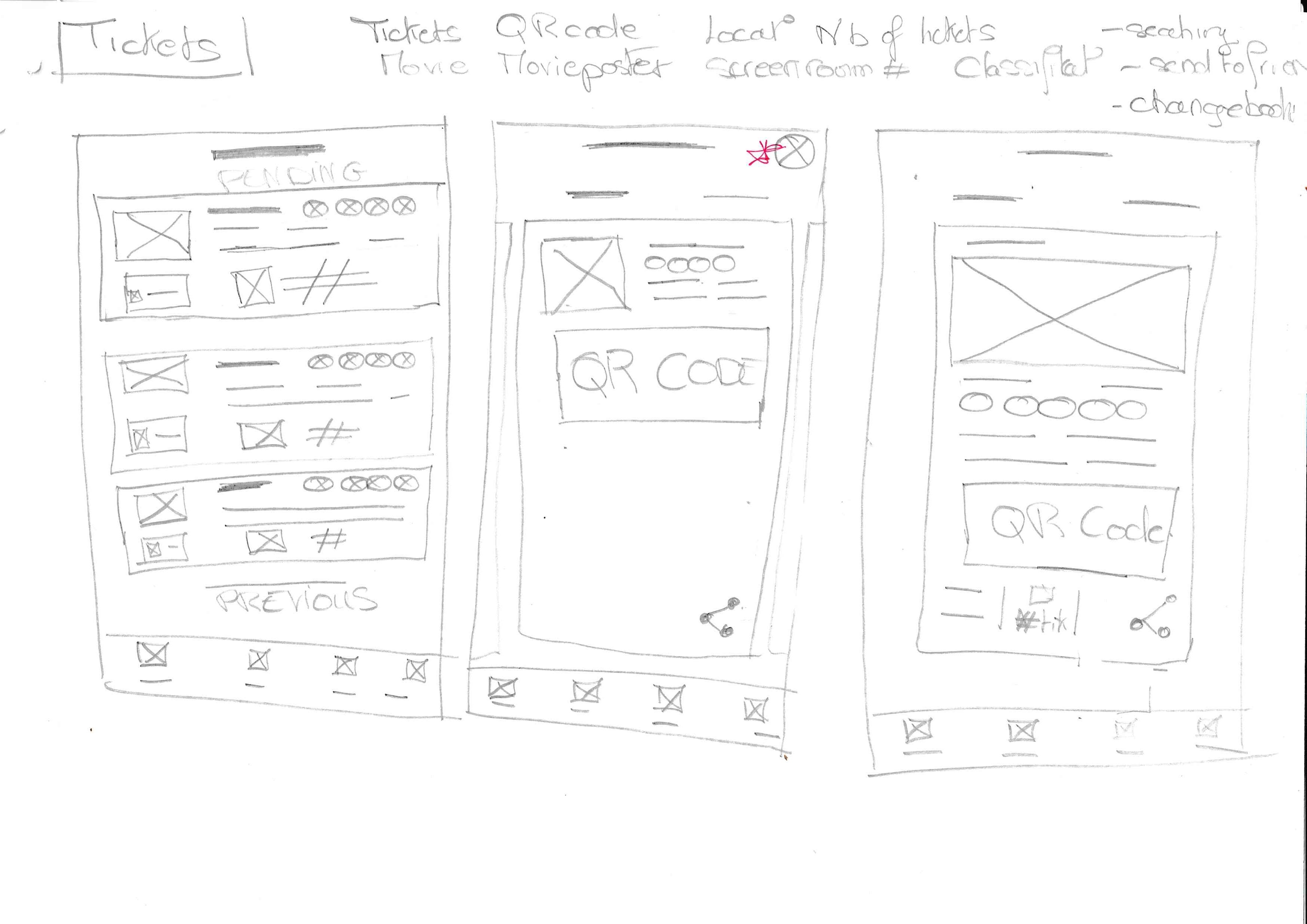
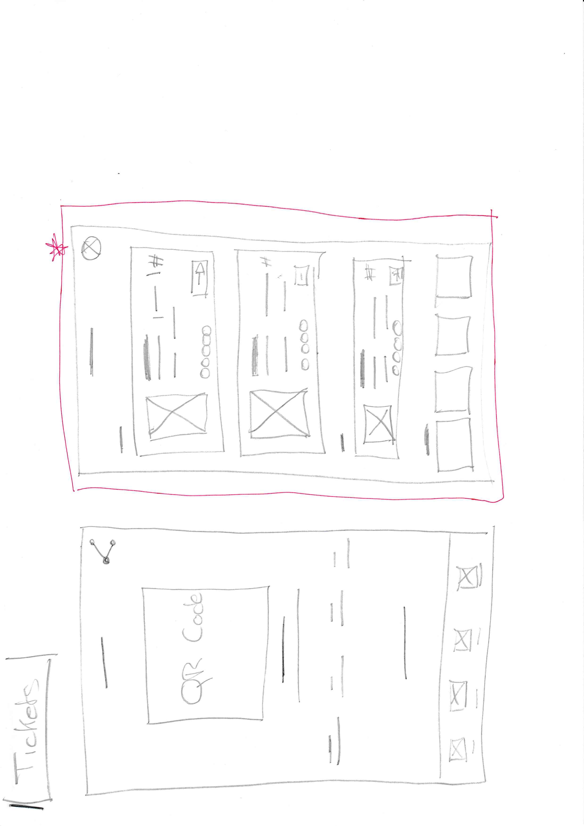
From sketches to lo-fi design
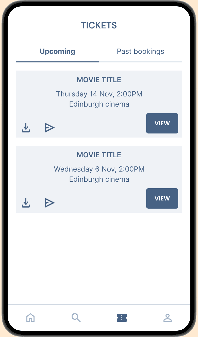
Hand-drawn sketches helped me explore and iterate screen ideas fast. I then translated the strongest concepts into lo-fi wireframes in Figma, keeping the design focused and consistent.
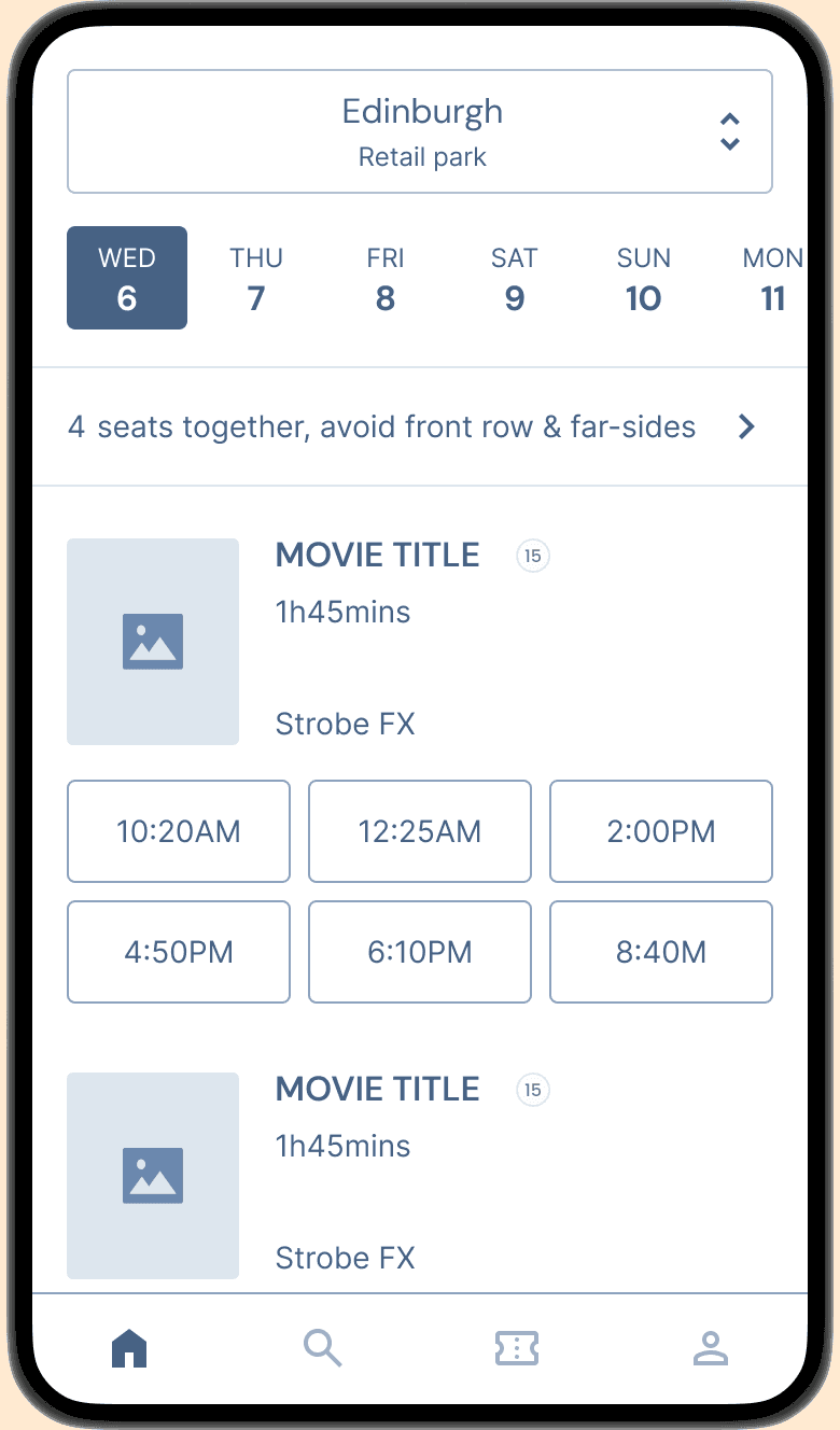
Home page
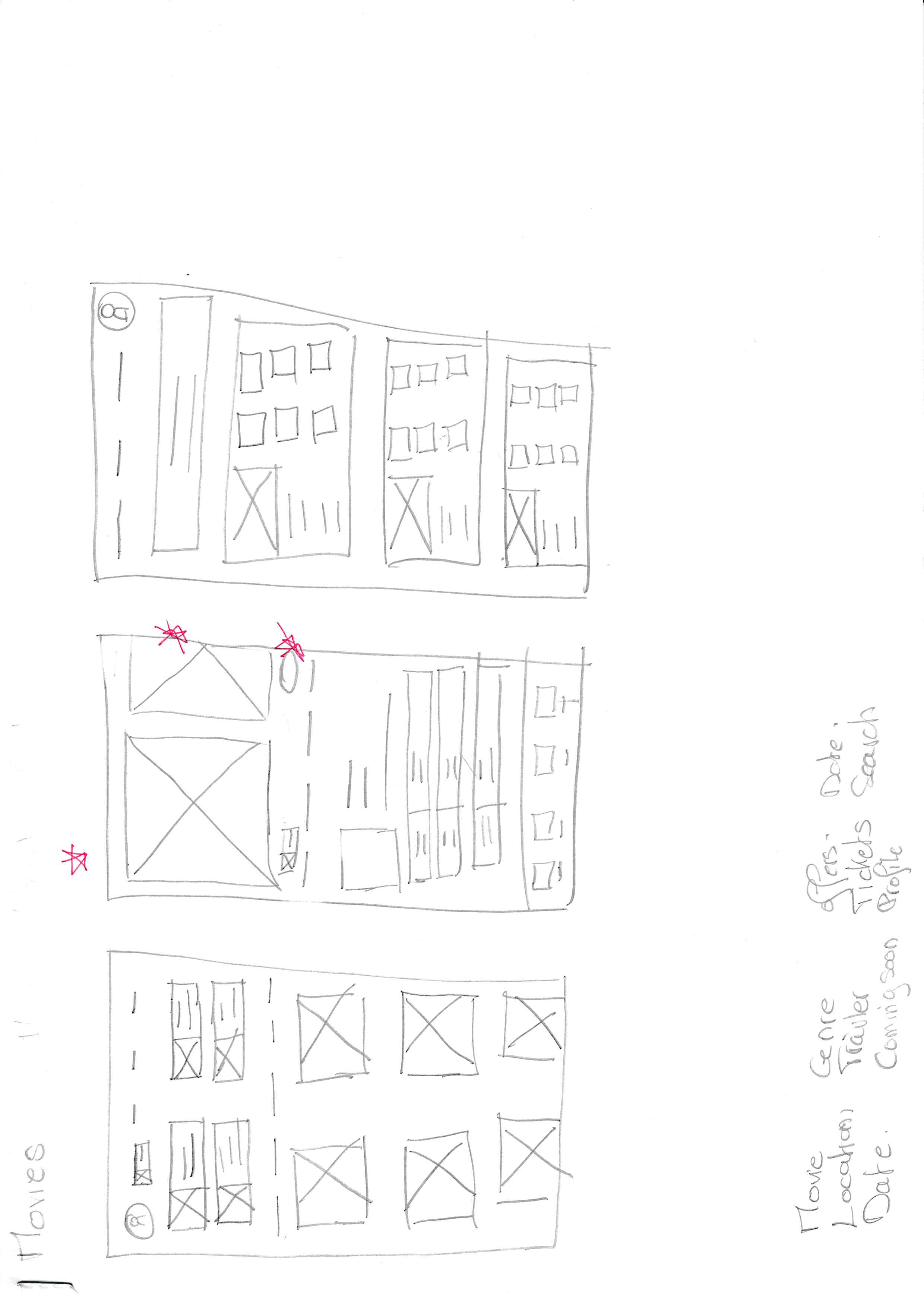

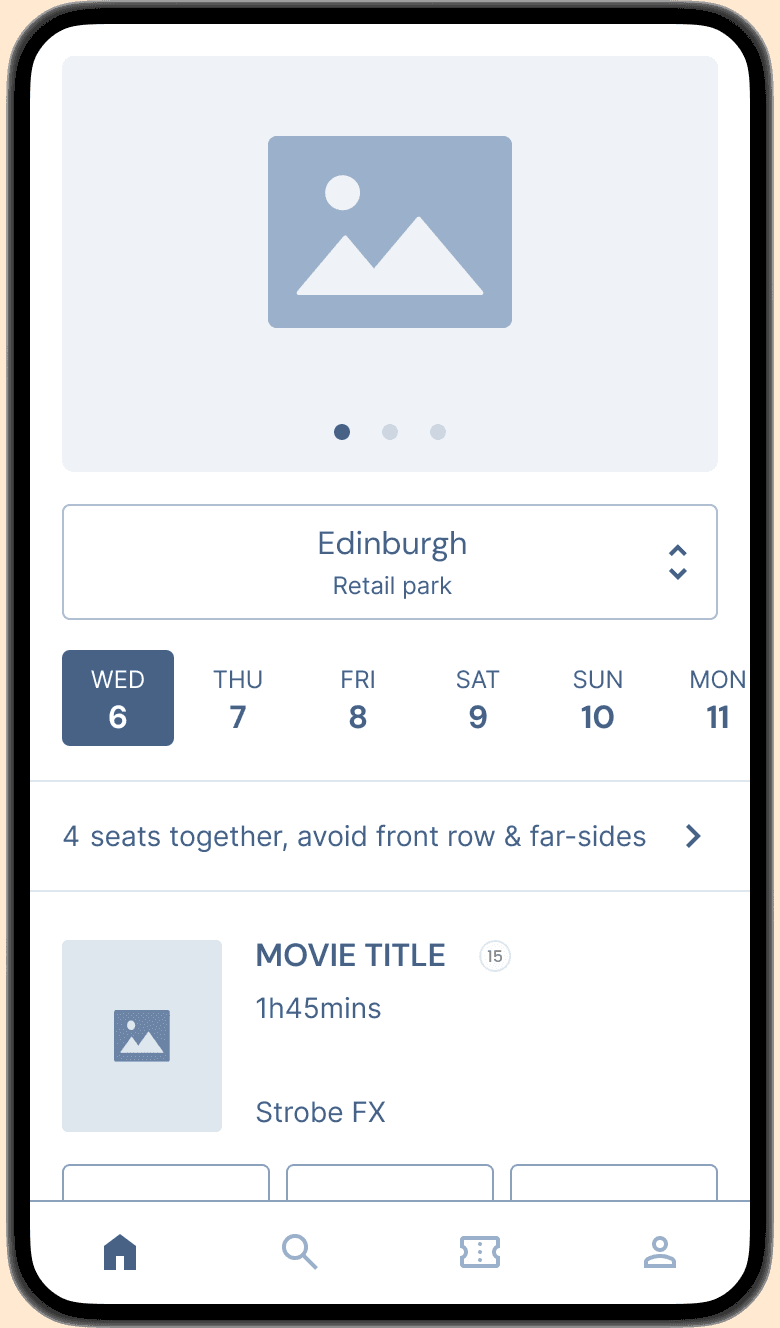
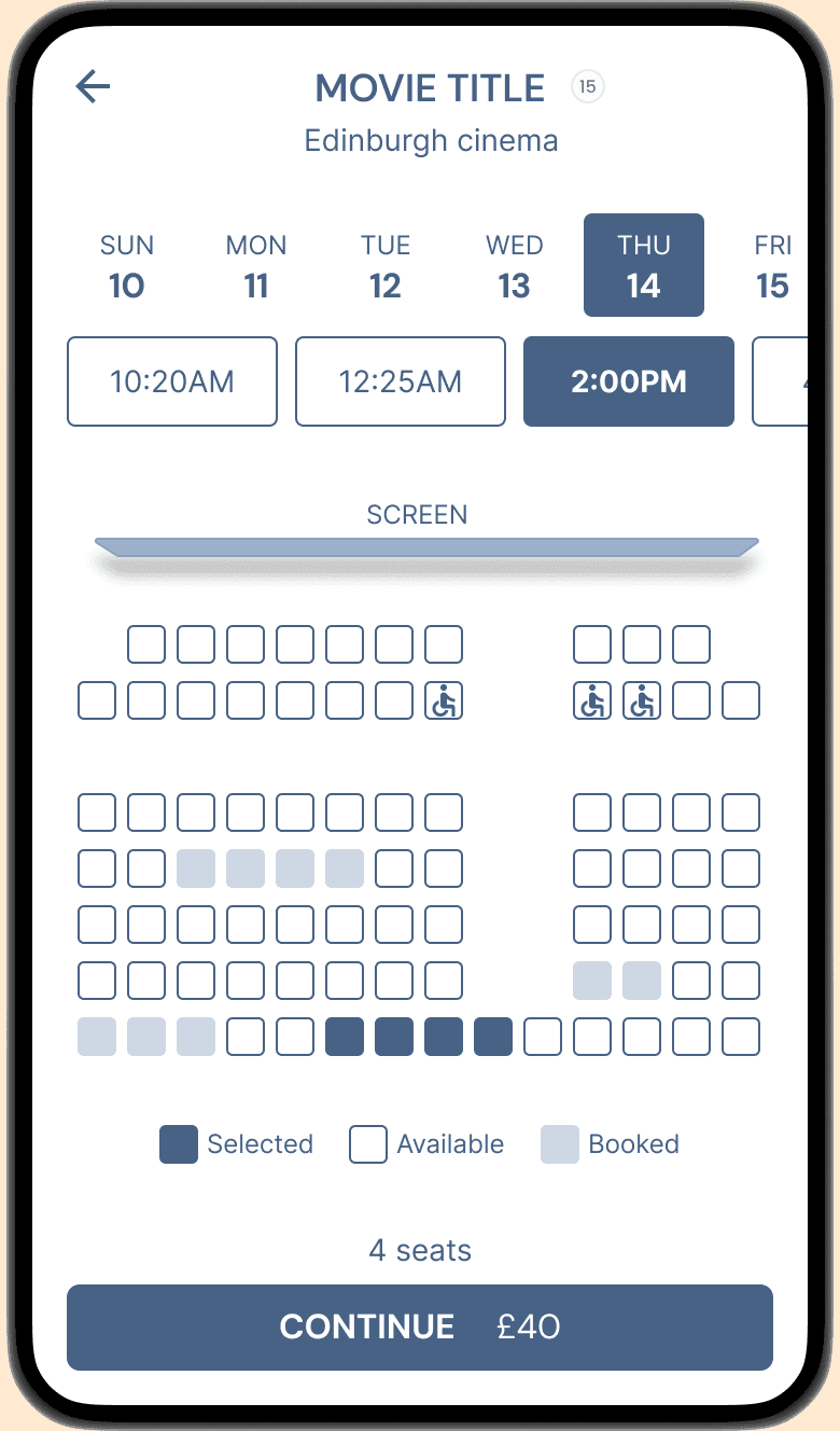
Select seats

User flow
Once the main screens were defined, I created low-fidelity wireframes in Figma and expanded the flow with extra screens, preparing for a fully clickable prototype.


Filters
With our app, you have access to a wide variety of filters to make your stable diffusion photos truly one-of-a-kind.
user-friendly
Our app is designed to be user-friendly, so you can start creating stunning stable diffusion photos right away.
Share
Share your stable diffusion photos with just a tap of a button!
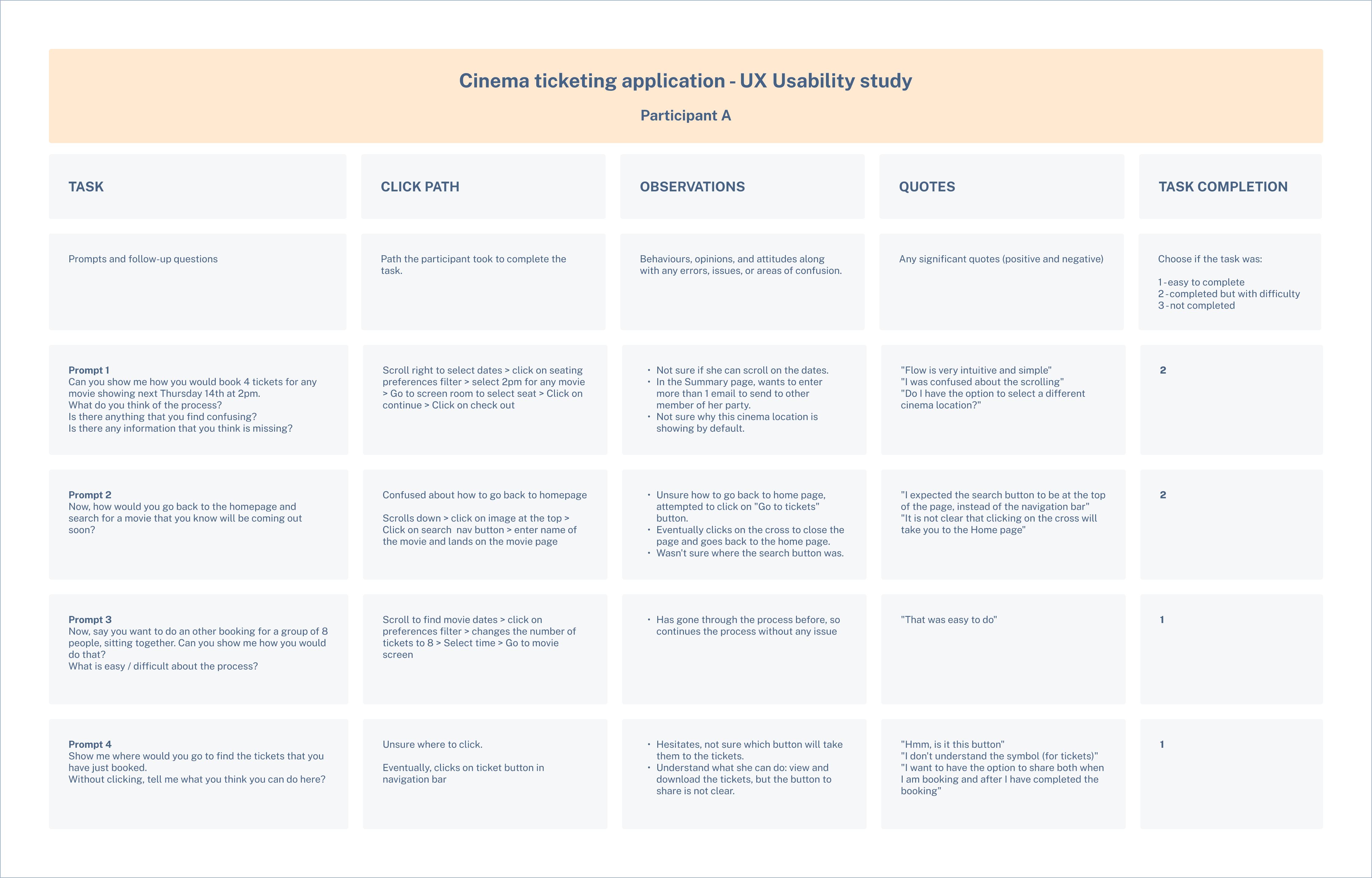
Putting the design to the test
I wanted to find out if the early prototype made it simple for users to pick a film, date, time, and seat. To do this, I put together a research plan that laid out the goals and questions guiding the test.
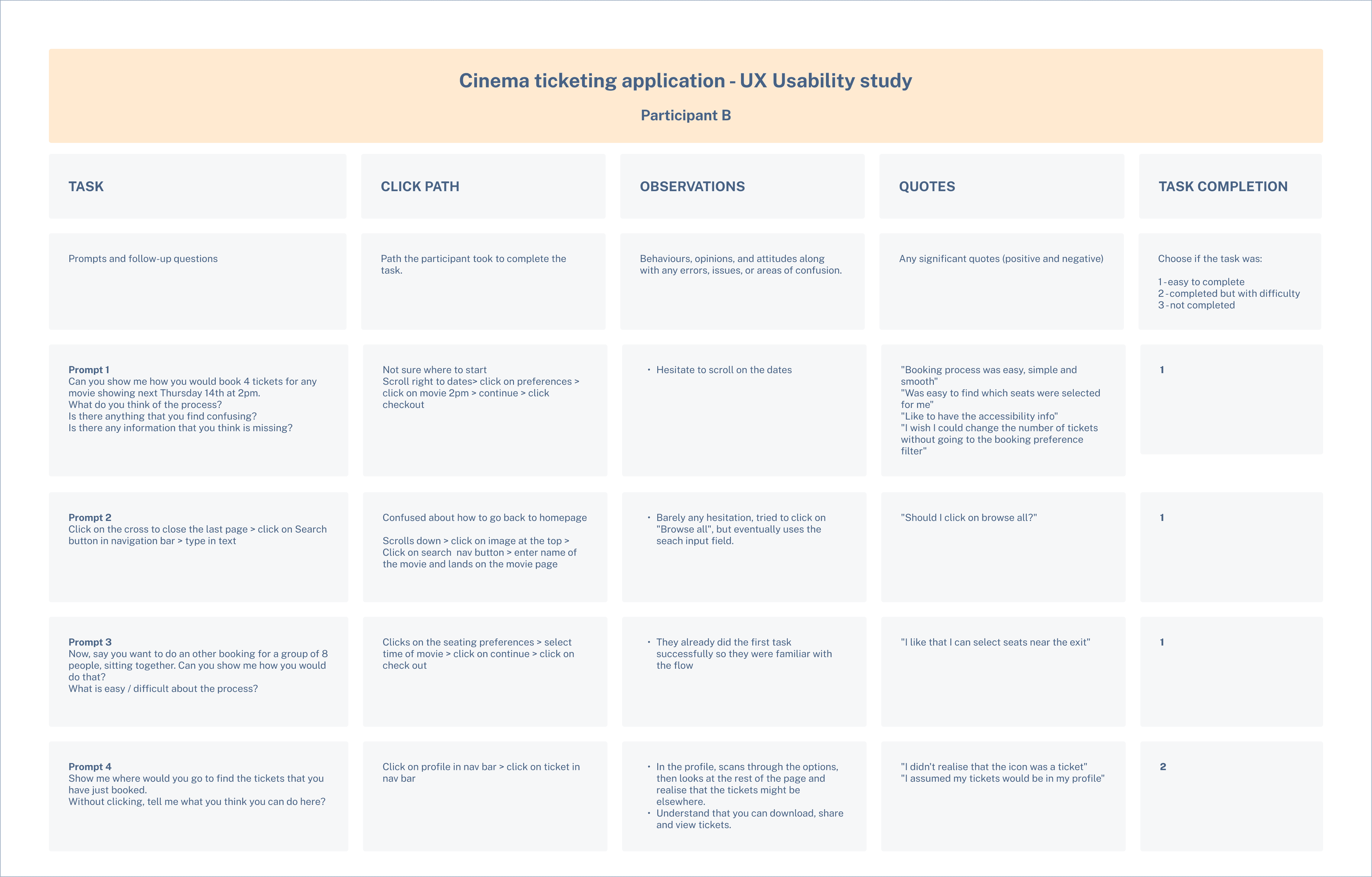
Methodical note-taking
I used a structured interview and note-taking template during usability testing to keep observations consistent and make analysis easier.
Affinity maps
Once my notes were ready, I turned them into digital post-its in Figma and grouped them into an affinity map. This made it easy to spot patterns and uncover the main user needs driving the design.

Key findings
Unclear navigation paths
Users struggled to change cinema location, apply seating filters, and understand post-purchase actions like the “Go to ticket” button.
Lack of ticket-sharing clarity
Users were unsure whether tickets could be shared or how to access them after purchase.
Friction in the booking process
Users wanted clearer info before checkout and fewer steps when selecting the number of tickets.
Refine the booking flow based on usability test findings
Define visual design elements (colour, typography, and interaction states)
Create high-fidelity designs and prototypes